【2.6.3】自相关和部分自相关图(Cross Correlation plot)
互相关图显示了两个时间序列相互之间的滞后。
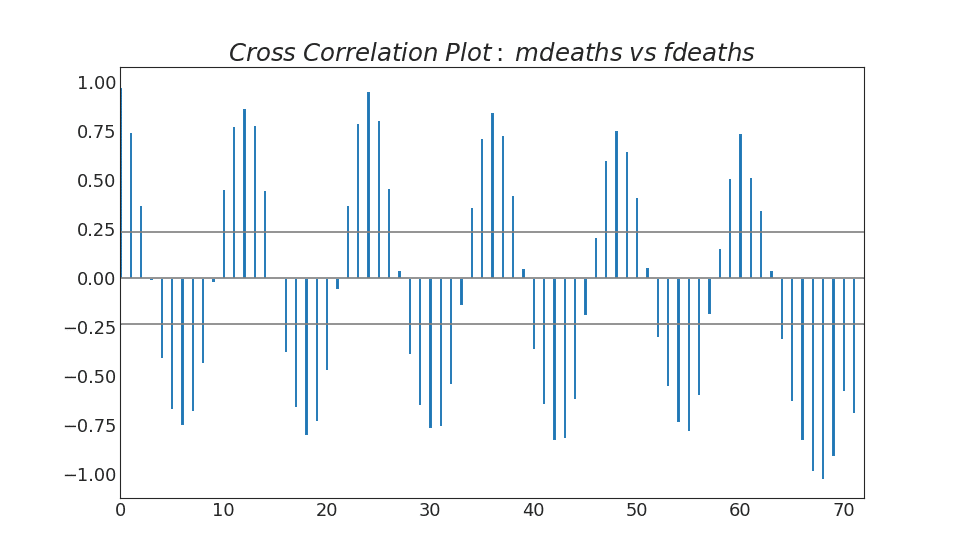
import statsmodels.tsa.stattools as stattools

# Import Data
df = pd.read_csv('https://github.com/selva86/datasets/raw/master/mortality.csv')
x = df['mdeaths']
y = df['fdeaths']

# Compute Cross Correlations
ccs = stattools.ccf(x, y)[:100]
nlags = len(ccs)

# Compute the Significance level
# ref: https://stats.stackexchange.com/questions/3115/cross-correlation-significance-in-r/3128#3128
conf_level = 2 / np.sqrt(nlags)

# Draw Plot
plt.figure(figsize=(12,7), dpi= 80)

plt.hlines(0, xmin=0, xmax=100, color='gray')  # 0 axis
plt.hlines(conf_level, xmin=0, xmax=100, color='gray')
plt.hlines(-conf_level, xmin=0, xmax=100, color='gray')

plt.bar(x=np.arange(len(ccs)), height=ccs, width=.3)

# Decoration
plt.title('$Cross\; Correlation\; Plot:\; mdeaths\; vs\; fdeaths$', fontsize=22)
plt.xlim(0,len(ccs))
plt.show()
参考资料
药企,独角兽,苏州。团队长期招人,感兴趣的都可以发邮件聊聊:tiehan@sina.cn
![]() 个人公众号,比较懒,很少更新,可以在上面提问题,如果回复不及时,可发邮件给我: tiehan@sina.cn
个人公众号,比较懒,很少更新,可以在上面提问题,如果回复不及时,可发邮件给我: tiehan@sina.cn