【2.1.1】箱线图(seaborn-boxplot)
一、函数说明:
seaborn.boxplot(x=None, y=None, hue=None, data=None, order=None, hue_order=None, orient=None, color=None, palette=None, saturation=0.75, width=0.8, dodge=True, fliersize=5, linewidth=None, whis=1.5, notch=False, ax=None, **kwargs)
二、案例
案例1

>>> import seaborn as sns
>>> sns.set(style="whitegrid")
>>> tips = sns.load_dataset("tips")
>>> ax = sns.boxplot(x=tips["total_bill"])
案例2
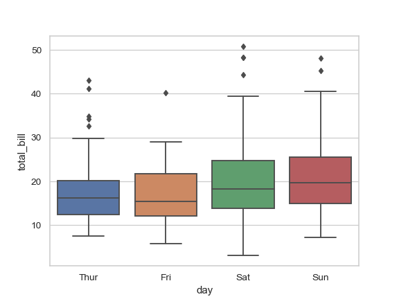
>>> ax = sns.boxplot(x="day", y="total_bill", data=tips)
案例3:分类变量
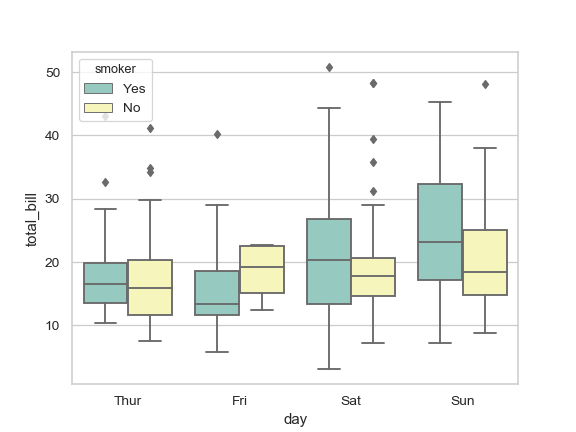
>>> ax = sns.boxplot(x="day", y="total_bill", hue="smoker",
...                  data=tips, palette="Set3")
案例4:当某些数据为空时
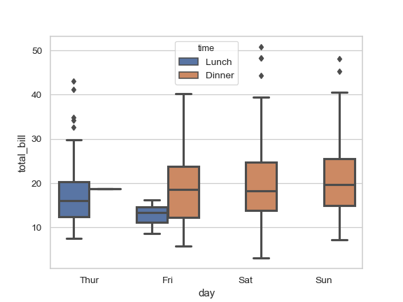
>>> ax = sns.boxplot(x="day", y="total_bill", hue="time",
...                  data=tips, linewidth=2.5)
案例5 排序
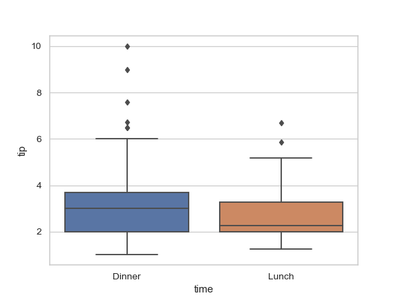
>>> ax = sns.boxplot(x="time", y="tip", data=tips,
...                  order=["Dinner", "Lunch"])
案例6 水平boxplot
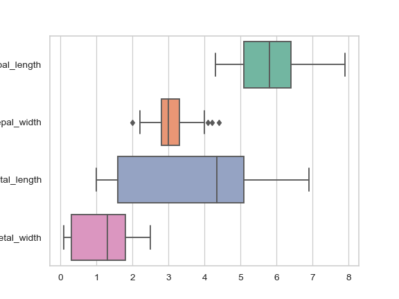
>>> iris = sns.load_dataset("iris")
>>> ax = sns.boxplot(data=iris, orient="h", palette="Set2")
案例6 不改变box大小
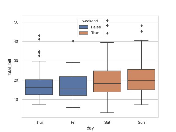
>>> tips["weekend"] = tips["day"].isin(["Sat", "Sun"])
>>> ax = sns.boxplot(x="day", y="total_bill", hue="weekend",
...                  data=tips, dodge=False)
案例7 显示点
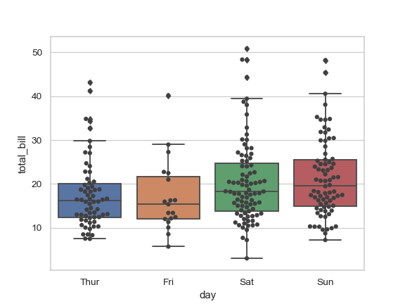
>>> ax = sns.boxplot(x="day", y="total_bill", data=tips)
>>> ax = sns.swarmplot(x="day", y="total_bill", data=tips, color=".25")
案例8 图分页
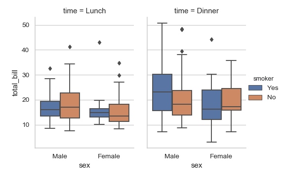
>>> g = sns.catplot(x="sex", y="total_bill",
...                 hue="smoker", col="time",
...                 data=tips, kind="box",
...                 height=4, aspect=.7);
案例8 boxplot不显示outlier
方法1:
ax = sns.boxplot(data=phenotype_info_merge, orient="h", y="primary disease or tissue", x='value', hue='SampleType',
                 order=sorted_pairs,palette=choosed_color,flierprops=flierprops,hue_order=choosed_sample_sites,showfliers=False)
方法二(这种方法更稳妥,只是将outlier变小):
flierprops = dict(markerfacecolor='0.75', markersize=0.01,
                  linestyle='none')
ax = sns.boxplot(data=phenotype_info_merge, orient="h", y="primary disease or tissue", x='value', hue='SampleType',
                 order=sorted_pairs,palette=choosed_color,flierprops=flierprops,hue_order=choosed_sample_sites) #
案例9 boxplot的box线条调整颜色
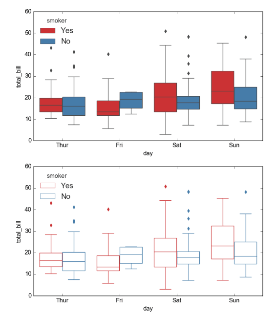
import matplotlib.pyplot as plt
import seaborn as sns

fig,(ax1,ax2) = plt.subplots(2)

sns.set_style("whitegrid")
tips = sns.load_dataset("tips")

sns.boxplot(x="day", y="total_bill", hue="smoker", data=tips, palette="Set1", ax=ax1)
sns.boxplot(x="day", y="total_bill", hue="smoker", data=tips, palette="Set1", ax=ax2)

for i,artist in enumerate(ax2.artists):
    # Set the linecolor on the artist to the facecolor, and set the facecolor to None
    col = artist.get_facecolor()
    artist.set_edgecolor(col)
    artist.set_facecolor('None')

    # Each box has 6 associated Line2D objects (to make the whiskers, fliers, etc.)
    # Loop over them here, and use the same colour as above
    for j in range(i*6,i*6+6):
        line = ax2.lines[j]
        line.set_color(col)
        line.set_mfc(col)
        line.set_mec(col)

# Also fix the legend
for legpatch in ax2.get_legend().get_patches():
    col = legpatch.get_facecolor()
    legpatch.set_edgecolor(col)
    legpatch.set_facecolor('None')

plt.show()
如果要去掉outlier,可以通过flierprops传递markersize这种方式,如果直接用showfliers=False有可能会错位
flierprops = dict(markerfacecolor='0.75', markersize=0.01,
                  linestyle='none')
ax = sns.boxplot(data=phenotype_info_merge, orient="h", y="primary disease or tissue", x='value', hue='SampleType',
                 order=sorted_pairs,palette=choosed_color,flierprops=flierprops,hue_order=choosed_sample_sites) #
案例10 title背景色占满
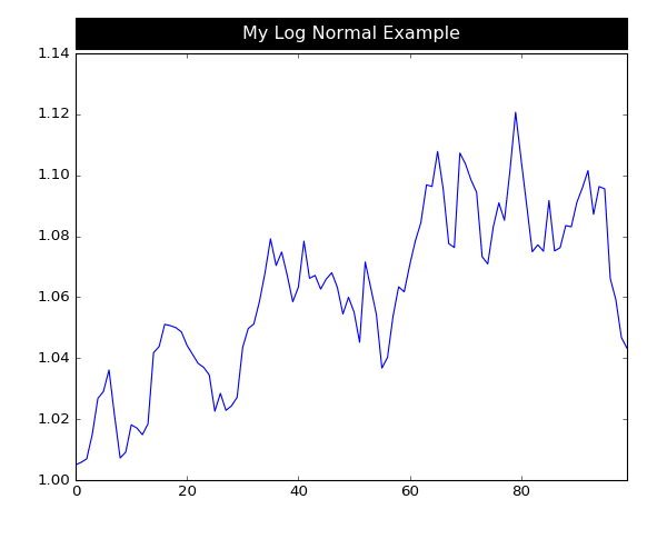
import matplotlib.pyplot as plt
import pandas as pd
import numpy as np

s = pd.Series(np.random.lognormal(.001, .01, 100))
ax = s.cumprod().plot()
title = ax.set_title('My Log Normal Example', position=(.5, 1.02),
             backgroundcolor='black', color='white',
             verticalalignment="bottom", horizontalalignment="center")

title._bbox_patch._mutation_aspect = 0.04  ## 这个参数控制title高度
title.get_bbox_patch().set_boxstyle("square", pad=11.9)  ## pad控制box的宽度
plt.tight_layout()
plt.savefig(__file__+".png")
plt.show()
这个方法很简单,但是不够灵活,更多的理解见下面的参考资料
案例11 legend放到图外
plt.subplots_adjust(bottom=.06, top=.91, left=.50, right=.82, hspace=0.2) #控制box图的位置,给lend预留出空间
plt.legend(bbox_to_anchor=(1.01, 1), loc=2,fontsize=18,  borderaxespad=0.) legend放在左上角
案例12 指定box的颜色
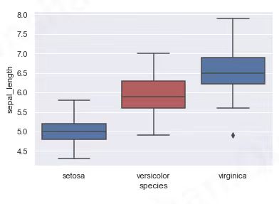
代码:
# libraries & dataset
import seaborn as sns
import matplotlib.pyplot as plt
# set a grey background (use sns.set_theme() if seaborn version 0.11.0 or above)
sns.set(style="darkgrid")
df = sns.load_dataset('iris')

my_pal = {species: "r" if species == "versicolor" else "b" for species in df.species.unique()}
sns.boxplot( x=df["species"], y=df["sepal_length"], palette=my_pal)
plt.show()
三、我的案例
案例一:
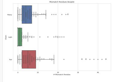
import seaborn as sns

import datetime
import matplotlib

# matplotlib.use('Agg')
import matplotlib.pyplot as plt
from matplotlib.dates import date2num
from collections import Counter
import matplotlib.patches as mpatches
import numpy as np
import pandas as pd
from matplotlib import pyplot


df_1  = pd.read_csv('result/heavy_mismatch-2.tsv',sep='\t',index_col=0,header=None )
df_2  = pd.read_csv('result/light_mismatch-2.tsv',sep='\t',index_col=0,header=None )
df_3  = pd.read_csv('result/pair_mismatch-2.tsv',sep='\t',index_col=0,header=None )

df_1['category'] = 'Heavy'
df_2['category'] = 'Light'
df_3['category'] = 'Pair'

df = pd.concat([df_1,df_2,df_3])

sns.set(style="whitegrid")

a4_dims = (11.7, 8.27)
fig, ax = pyplot.subplots(figsize=a4_dims)


# ax = sns.violinplot(x=1, y="category",data=df, dodge=False)
ax = sns.boxplot(x=1, y="category",data=df)
ax = sns.swarmplot(x=1, y="category", data=df,  alpha=0.5,color='0.25')
ax.set(xlabel='# Mismatch Residue', ylabel='Chain')  # 添加xlabel,ylabel
plt.title('Mismatch Residues Boxplot')
ax.figure.savefig('pic/pair-mismatch-boxplot-2.jpeg')
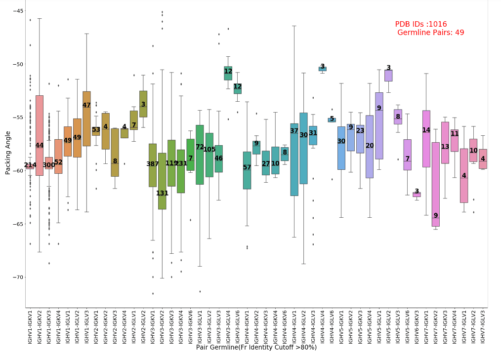
案例二
import pandas as pd
import matplotlib
import matplotlib.pyplot as plt
import seaborn as sns
from matplotlib import pyplot

df_raw = pd.read_table('5.blast_dir/hl_germline_blast_result_cutoff_80-high-resolution-famlily.tsv')
df_raw['HL_map']= df_raw['H_map'] +'-' +df_raw['L_map']
germline_pairs_raw = set([iii.split('_')[0] for iii in df_raw['HL_map']])
cut_frequency = 3

df=df_raw.copy()
for one_key in germline_pairs_raw:
    if len(df[df['HL_map']== one_key] ) <cut_frequency:

        df=df[~df['HL_map'].isin([one_key])]


pdb_ids = set([iii.split('_')[0] for iii in df['#PDB_chains']])
germline_pairs = set([iii.split('_')[0] for iii in df['HL_map']])

h_chains = set([iii.split('_')[0] for iii in df['H_map']])
l_chains = set([iii.split('_')[0] for iii in df['L_map']])
sorted_h_chains = sorted(h_chains)
sorted_l_chains = sorted(l_chains)

sorted_pairs = []
for ii in sorted_h_chains:
    for jj in sorted_l_chains:
        pair_hl = '%s-%s' % (ii,jj)
        if pair_hl in germline_pairs:
            sorted_pairs.append(pair_hl)

a4_dims = (32,22)
fig, ax = pyplot.subplots(figsize=a4_dims)

ax = sns.boxplot(x= 'HL_map',y='Angle',data=df,order=sorted_pairs)
ax.set(xlabel='Pair Germline(Fv Identity Cutoff >80%)', ylabel='Packing Angle')
plt.xticks(rotation=90)

## 给每个boxplot添加 点的个数
medians = []
nobs = []
for one_key in sorted_pairs:
    df_select = df[df['HL_map']==one_key]
    medians.append(df_select['Angle'].median())
    nobs.append(df_select['HL_map'].value_counts().values[0])
pos = range(len(nobs))
for tick,label in zip(pos,ax.get_xticklabels()):
    ax.text(pos[tick], medians[tick] + 0.03, nobs[tick],horizontalalignment='center', size=24, color='black', weight='semibold')

# 调整字体大小
plt.rc('xtick', labelsize=24)
plt.rc('ytick', labelsize=24)
plt.rc('axes', labelsize=24)
plt.rc('axes', titlesize=24)
plt.rc('legend', fontsize=24)

# plt.title('Mismatch Residues Boxplot')

ax.text(0.8, 0.9, 'PDB IDs :%s \n Germline Pairs: %s' % (len(pdb_ids),len(germline_pairs)), horizontalalignment='left',  verticalalignment='center', transform=ax.transAxes,fontsize=28, color='red')

ax.figure.savefig('pic/fv_pair-family-germline-cutoff_80-high-resolution.jpeg')
print 'Finish!'
参考资料
- https://seaborn.pydata.org/generated/seaborn.boxplot.html
- https://python-graph-gallery.com/38-show-number-of-observation-on-boxplot/
- https://stackoverflow.com/questions/36874697/how-to-edit-properties-of-whiskers-fliers-caps-etc-in-seaborn-boxplot
- https://stackoverflow.com/questions/40796117/how-do-i-make-the-width-of-the-title-box-span-the-entire-plot
药企,独角兽,苏州。团队长期招人,感兴趣的都可以发邮件聊聊:tiehan@sina.cn
![]() 个人公众号,比较懒,很少更新,可以在上面提问题,如果回复不及时,可发邮件给我: tiehan@sina.cn
个人公众号,比较懒,很少更新,可以在上面提问题,如果回复不及时,可发邮件给我: tiehan@sina.cn