【2.3】seaborn直方图(seaborn-distplot)
单变量作图
一、参数说明
二、示例
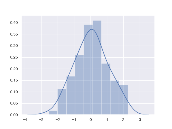
2.1 一般用法
>>> import seaborn as sns, numpy as np
>>> sns.set(); np.random.seed(0)
>>> x = np.random.randn(100)
>>> ax = sns.distplot(x)
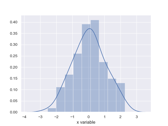
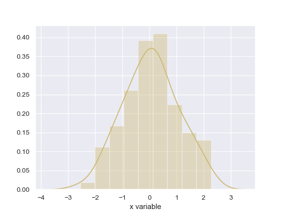
2.2 用pandas的对象,会获得x轴坐标名
>>> import pandas as pd
>>> x = pd.Series(x, name="x variable")
>>> ax = sns.distplot(x)
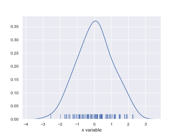
2.3 只显示 kernel density和rug plot
>>> ax = sns.distplot(x, rug=True, hist=False)
2.4 直方图分布和最大似然高斯分布
>>> from scipy.stats import norm
>>> ax = sns.distplot(x, fit=norm, kde=False)

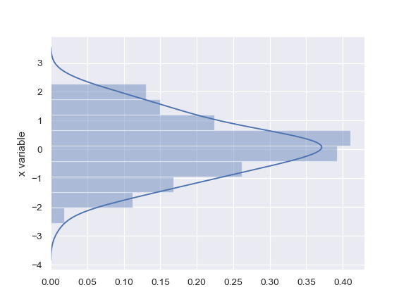
2.5 横纵坐标反着来
>>> ax = sns.distplot(x, vertical=True)
2.6 改变颜色
>>> sns.set_color_codes()
>>> ax = sns.distplot(x, color="y")
2.7 传递参数
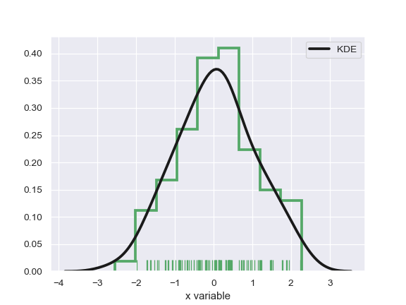
>>> ax = sns.distplot(x, rug=True, rug_kws={"color": "g"},
...                   kde_kws={"color": "k", "lw": 3, "label": "KDE"},
...                   hist_kws={"histtype": "step", "linewidth": 3,
...                             "alpha": 1, "color": "g"})
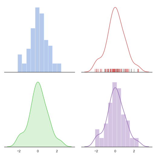
import numpy as np
import seaborn as sns
import matplotlib.pyplot as plt

sns.set(style="white", palette="muted", color_codes=True)
rs = np.random.RandomState(10)

# Set up the matplotlib figure
f, axes = plt.subplots(2, 2, figsize=(7, 7), sharex=True)
sns.despine(left=True)

# Generate a random univariate dataset
d = rs.normal(size=100)

# Plot a simple histogram with binsize determined automatically
sns.distplot(d, kde=False, color="b", ax=axes[0, 0])

# Plot a kernel density estimate and rug plot
sns.distplot(d, hist=False, rug=True, color="r", ax=axes[0, 1])

# Plot a filled kernel density estimate
sns.distplot(d, hist=False, color="g", kde_kws={"shade": True}, ax=axes[1, 0])

# Plot a historgram and kernel density estimate
sns.distplot(d, color="m", ax=axes[1, 1])

plt.setp(axes, yticks=[])
plt.tight_layout()
三、我的案例
from numpy.random import normal
import pandas as pd
import matplotlib.pyplot as plt
from numpy.random import normal
import seaborn as sns

input_tsv = 'result/UTR3_hg19.tsv'
df = pd.read_csv(input_tsv,sep='\t')


print(df.head())

# lens = list([float(ii) for ii in df['gc']])

# plt.xlim(0,1000)
# plt.hist(lens,bins=100, normed=True)

sns.histplot(data=df, x="GC",  binwidth=10,stat="percent") # ,stat="percent"

plt.title("Human 3'UTR GC content distribution (%s, )" % len(lens))
plt.xlabel("GC content(%)")
plt.ylabel("Percent(%)")
plt.show()
四、讨论
参考资料
药企,独角兽,苏州。团队长期招人,感兴趣的都可以发邮件聊聊:tiehan@sina.cn
![]() 个人公众号,比较懒,很少更新,可以在上面提问题,如果回复不及时,可发邮件给我: tiehan@sina.cn
个人公众号,比较懒,很少更新,可以在上面提问题,如果回复不及时,可发邮件给我: tiehan@sina.cn