【2.1.3】散点图线性拟合(Scatter plot with linear regression line of best fit,pearson)
如果你想了解两个变量如何相互改变,那么line of best fit就是趋势。
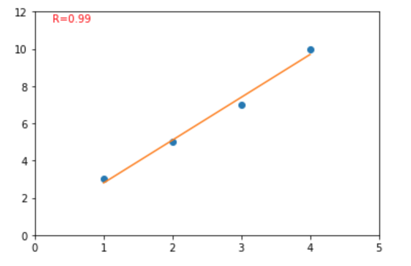
案例一:
from scipy import stats
import matplotlib.pyplot as plt

x = [1,2,3,4]
y = [3,5,7,10]   # 10, not 9, so the fit isn't perfect

#remove nan
dt = {'x':x,'y':y}
df_1 = pd.DataFrame(dt)
df_2 = df_1.dropna()
x = df_2['x']
y = df_2['y']


slope, intercept, r_value, p_value, std_err = stats.linregress(x, y)
line = [slope*ii for ii in x] + intercept

plt.plot(x, y, 'o', x, line)
plt.annotate('R=%.2f\n' % (r_value), xy=(0.05, 0.9), xycoords='axes fraction',color='red')

plt.xlim(0, 5)
plt.ylim(0, 12)
plt.show()
更好的代码(需要做颜色的标准):
df['category']  = 'black'
for index_1,row_1 in df.iterrows():
    category = row_1['Seq']
    if category in inhouse_seq:
        df.loc[index_1,'category'] = 'red'

data = df

fig,ax=plt.subplots(figsize=(12,8))

xx = 'coding_5_3'
yy = 'in_vitro'

slope, intercept, r_value, p_value, std_err = stats.linregress(df[xx], df[yy])
line = [slope*ii for ii in df[xx]] + intercept

ax.scatter(xx, yy,c=df.category, data=df) # , cmap="tab10"  ,  alpha=.8
plt.plot(df[xx], line, color='red') #
ax.annotate('R=%.2f\n' % (r_value), xy=(0.05, 0.9), xycoords='axes fraction',color='red',fontsize=20)

xxx = list(df[xx])
yyy = list(df[yy])
zzz = list(df['Seq'])
for ii in range(len(df)):
    ax.text(xxx[ii], yyy[ii]+0.5, zzz[ii], ha="center", va="center", size=10)

plt.xlabel('5-MFE (kcal/mol)', size=20)
plt.ylabel('In_vitro_expression(mg/ml)', size=20)
ax.set_title('Correlation between in vitro expression and 5-MFE',size=24)

plt.show()
案例二
下图显示了数据中各组之间最佳拟合线的差异。 要禁用分组并仅为整个数据集绘制一条最佳拟合线,请从下面的sns.lmplot()调用中删除hue =‘cyl’参数。

# Import Data
df = pd.read_csv("https://raw.githubusercontent.com/selva86/datasets/master/mpg_ggplot2.csv")
df_select = df.loc[df.cyl.isin([4,8]), :]

# Plot
sns.set_style("white")
gridobj = sns.lmplot(x="displ", y="hwy", hue="cyl", data=df_select,
                     height=7, aspect=1.6, robust=True, palette='tab10',
                     scatter_kws=dict(s=60, linewidths=.7, edgecolors='black'))

# Decorations
gridobj.set(xlim=(0.5, 7.5), ylim=(0, 50))
plt.title("Scatterplot with line of best fit grouped by number of cylinders", fontsize=20)
plt.show()
或者,您可以在其自己的列中显示每个组的最佳拟合线。 您可以通过在sns.lmplot()中设置col = groupingcolumn参数来实现此目的。
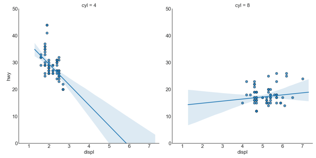
# Import Data
df = pd.read_csv("https://raw.githubusercontent.com/selva86/datasets/master/mpg_ggplot2.csv")
df_select = df.loc[df.cyl.isin([4,8]), :]

# Each line in its own column
sns.set_style("white")
gridobj = sns.lmplot(x="displ", y="hwy",
                     data=df_select,
                     height=7,
                     robust=True,
                     palette='Set1',
                     col="cyl",
                     scatter_kws=dict(s=60, linewidths=.7, edgecolors='black'))

# Decorations
gridobj.set(xlim=(0.5, 7.5), ylim=(0, 50))
plt.show()
参考资料
药企,独角兽,苏州。团队长期招人,感兴趣的都可以发邮件聊聊:tiehan@sina.cn
![]() 个人公众号,比较懒,很少更新,可以在上面提问题,如果回复不及时,可发邮件给我: tiehan@sina.cn
个人公众号,比较懒,很少更新,可以在上面提问题,如果回复不及时,可发邮件给我: tiehan@sina.cn