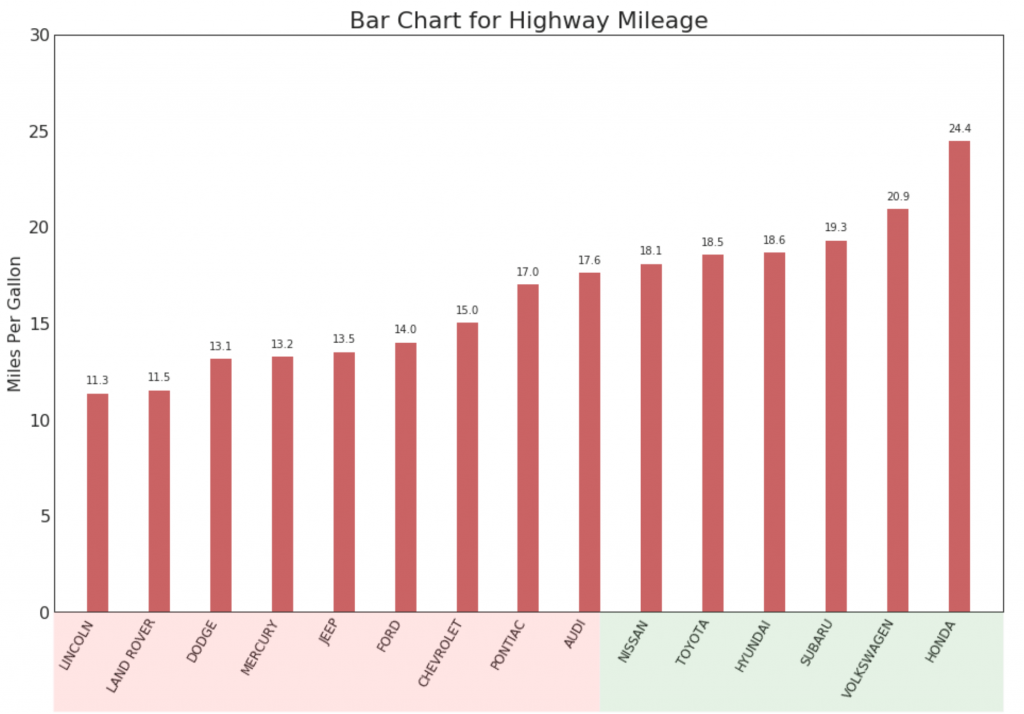
【2.3.1】排序条形图(Ordered Bar Chart)
有序条形图有效地传达了项目的排名顺序。 但是,在图表上方添加度量标准的值,用户可以从图表本身获取精确信息。
# Prepare Data
df_raw = pd.read_csv("https://github.com/selva86/datasets/raw/master/mpg_ggplot2.csv")
df = df_raw[['cty', 'manufacturer']].groupby('manufacturer').apply(lambda x: x.mean())
df.sort_values('cty', inplace=True)
df.reset_index(inplace=True)

# Draw plot
import matplotlib.patches as patches

fig, ax = plt.subplots(figsize=(16,10), facecolor='white', dpi= 80)
ax.vlines(x=df.index, ymin=0, ymax=df.cty, color='firebrick', alpha=0.7, linewidth=20)

# Annotate Text
for i, cty in enumerate(df.cty):
    ax.text(i, cty+0.5, round(cty, 1), horizontalalignment='center')


# Title, Label, Ticks and Ylim
ax.set_title('Bar Chart for Highway Mileage', fontdict={'size':22})
ax.set(ylabel='Miles Per Gallon', ylim=(0, 30))
plt.xticks(df.index, df.manufacturer.str.upper(), rotation=60, horizontalalignment='right', fontsize=12)

# Add patches to color the X axis labels
p1 = patches.Rectangle((.57, -0.005), width=.33, height=.13, alpha=.1, facecolor='green', transform=fig.transFigure)
p2 = patches.Rectangle((.124, -0.005), width=.446, height=.13, alpha=.1, facecolor='red', transform=fig.transFigure)
fig.add_artist(p1)
fig.add_artist(p2)
plt.show()
参考资料
药企,独角兽,苏州。团队长期招人,感兴趣的都可以发邮件聊聊:tiehan@sina.cn
![]() 个人公众号,比较懒,很少更新,可以在上面提问题,如果回复不及时,可发邮件给我: tiehan@sina.cn
个人公众号,比较懒,很少更新,可以在上面提问题,如果回复不及时,可发邮件给我: tiehan@sina.cn