【2.6.4】堆积面积图(Stacked Area Chart)
一、堆积面积图 Stacked Area Chart
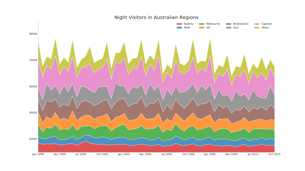
堆积面积图可以直观地显示多个时间序列的贡献程度,因此可以轻松地相互比较。
# Import Data
df = pd.read_csv('https://raw.githubusercontent.com/selva86/datasets/master/nightvisitors.csv')

# Decide Colors
mycolors = ['tab:red', 'tab:blue', 'tab:green', 'tab:orange', 'tab:brown', 'tab:grey', 'tab:pink', 'tab:olive']

# Draw Plot and Annotate
fig, ax = plt.subplots(1,1,figsize=(16, 9), dpi= 80)
columns = df.columns[1:]
labs = columns.values.tolist()

# Prepare data
x  = df['yearmon'].values.tolist()
y0 = df[columns[0]].values.tolist()
y1 = df[columns[1]].values.tolist()
y2 = df[columns[2]].values.tolist()
y3 = df[columns[3]].values.tolist()
y4 = df[columns[4]].values.tolist()
y5 = df[columns[5]].values.tolist()
y6 = df[columns[6]].values.tolist()
y7 = df[columns[7]].values.tolist()
y = np.vstack([y0, y2, y4, y6, y7, y5, y1, y3])

# Plot for each column
labs = columns.values.tolist()
ax = plt.gca()
ax.stackplot(x, y, labels=labs, colors=mycolors, alpha=0.8)

# Decorations
ax.set_title('Night Visitors in Australian Regions', fontsize=18)
ax.set(ylim=[0, 100000])
ax.legend(fontsize=10, ncol=4)
plt.xticks(x[::5], fontsize=10, horizontalalignment='center')
plt.yticks(np.arange(10000, 100000, 20000), fontsize=10)
plt.xlim(x[0], x[-1])

# Lighten borders
plt.gca().spines["top"].set_alpha(0)
plt.gca().spines["bottom"].set_alpha(.3)
plt.gca().spines["right"].set_alpha(0)
plt.gca().spines["left"].set_alpha(.3)

plt.show()
二、未堆积区域图
未堆积区域图用于可视化两个或更多个系列相对于彼此的进度(起伏)。 在下面的图表中,您可以清楚地看到随着失业中位数持续时间的增加,个人储蓄率会下降。 未堆积的区域图表很好地揭示了这种现象。

# Import Data
df = pd.read_csv("https://github.com/selva86/datasets/raw/master/economics.csv")

# Prepare Data
x = df['date'].values.tolist()
y1 = df['psavert'].values.tolist()
y2 = df['uempmed'].values.tolist()
mycolors = ['tab:red', 'tab:blue', 'tab:green', 'tab:orange', 'tab:brown', 'tab:grey', 'tab:pink', 'tab:olive']
columns = ['psavert', 'uempmed']

# Draw Plot
fig, ax = plt.subplots(1, 1, figsize=(16,9), dpi= 80)
ax.fill_between(x, y1=y1, y2=0, label=columns[1], alpha=0.5, color=mycolors[1], linewidth=2)
ax.fill_between(x, y1=y2, y2=0, label=columns[0], alpha=0.5, color=mycolors[0], linewidth=2)

# Decorations
ax.set_title('Personal Savings Rate vs Median Duration of Unemployment', fontsize=18)
ax.set(ylim=[0, 30])
ax.legend(loc='best', fontsize=12)
plt.xticks(x[::50], fontsize=10, horizontalalignment='center')
plt.yticks(np.arange(2.5, 30.0, 2.5), fontsize=10)
plt.xlim(-10, x[-1])

# Draw Tick lines
for y in np.arange(2.5, 30.0, 2.5):
    plt.hlines(y, xmin=0, xmax=len(x), colors='black', alpha=0.3, linestyles="--", lw=0.5)

# Lighten borders
plt.gca().spines["top"].set_alpha(0)
plt.gca().spines["bottom"].set_alpha(.3)
plt.gca().spines["right"].set_alpha(0)
plt.gca().spines["left"].set_alpha(.3)
plt.show()
参考资料
药企,独角兽,苏州。团队长期招人,感兴趣的都可以发邮件聊聊:tiehan@sina.cn
![]() 个人公众号,比较懒,很少更新,可以在上面提问题,如果回复不及时,可发邮件给我: tiehan@sina.cn
个人公众号,比较懒,很少更新,可以在上面提问题,如果回复不及时,可发邮件给我: tiehan@sina.cn